-
Downloads
- Joomla Downloads Joomla! Templates & Extensions
- Virtuemart Downloads Extension Specific Downloads
- JoomShopping Downloads Extension Specific Downloads
- Blog

For over 5 years the Yagendoo Joomla! templates have been based on a so-called response hybrid solution. So there was an own template with own layouts, which was only loaded for mobile devices. But this is now changing. All Yagendoo Joomla! templates are now available in a new version and completely responsive! That means, the views of the templates adapt themselves immediately to the device, with which the website is visited.
All new members of the Yagendoo Community don't have to pay attention to anything. After installing a fresh Quickstart package or a template on an existing website, everything is already done. The new functions are immediately ready for use.
We have decided to take this quite big step towards changing the basic template structure, as the advantages are obvious and outweigh the disadvantages. An essential requirement for a modern Joomla! template nowadays is the flexible adaptation of the layout to various mobile and non-mobile devices as well as screen formats. In principle, this was also possible with the previous hybrid solution of our templates, but also more cumbersome and complex, because the hybrid solution with its own module positions was equivalent to building its own website only for mobile devices.
Compared to 5 years ago, when we decided for the hybrid solution, today we have many new technical possibilities to build a responsive website much more efficiently. With Bootstrap 3, we rely on one of the most powerful web design frameworks currently available and, looking ahead to the release of Joomla! 4, we are deliberately no longer using the Bootstrap 2 provided by Joomla! 3. This means that we are already prepared for the future. Also to be able to guarantee the change to Bootstrap 4 later. Furthermore all Yagendoo Joomla! templates are compatible with all Yagendoo Joomla! modules. This was one of the main reasons why we decided against the use of Bootstrap in version 4 in this step, even if it was not easy for us.
In our previous blog post we already gave an outlook on today's update. In order to facilitate the transition to the fully responsive solution and to ensure sufficient time for the necessary adjustments, there was a temporary option to choose between the hybrid and responsive versions by parameter.
In the new version of all templates published today this option is omitted and the responsive layout is activated by default.
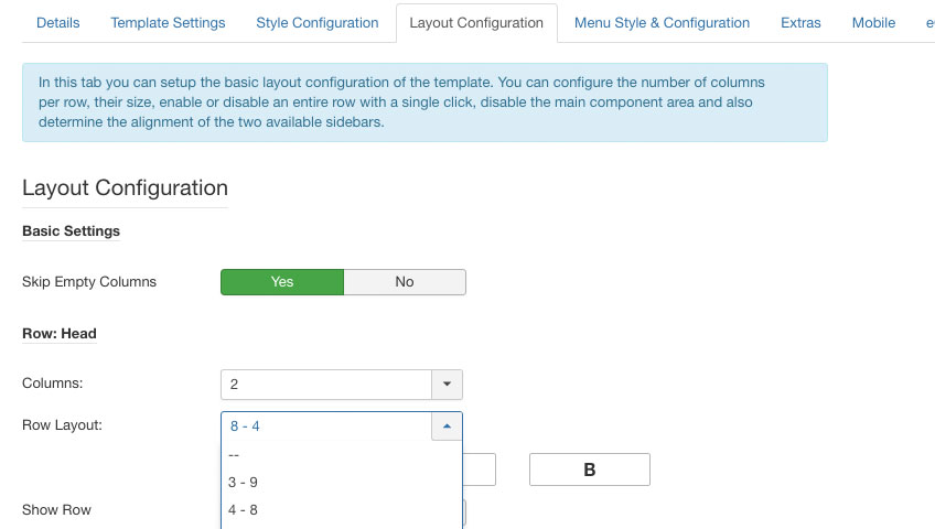
In the course of the conversion, the configuration of the module rows in the template settings (tab: "Layout configuration") was also adapted to the Bootstrap standard.

The previous percentage distribution of the columns within the rows was replaced by the familiar grid system of Bootstrap 3. In order to be able to use this feature properly, the cache of the used browser should be emptied after installing the update so that the updated Javascript files can be loaded.
Members of the Yagendoo community, who already use one of the Yagendoo Joomla! templates, we would like to give some hints at this point. Because the structure of the templates has changed in the course of the updates, at least some things have to be checked after the update. In this article we show the most important points and explain what you should pay attention to in order to avoid potential problems.
Although we generally recommend or require this, we strongly recommend that you test this update in a test system – i.e. not on a live website – before. And in any case, make a backup of the website beforehand. We always do our best to avoid problems, but cannot guarantee this.
In the blog post linked above, the mobile module positions were already mentioned, which will no longer be available after the update. This also means that modules previously placed in the hybrid layout will no longer be available. Instead, the modules from the normal view are now also displayed in the mobile view. If necessary, modules have to be reassigned if they were not already assigned twice for mobile and non-mobile views.
Here once again the list of the module positions which are immediately omitted:
In addition, we describe in the blog post how to proceed in order to continue outputting the special content – that may be placed there. And how modules for certain screen sizes, so-called viewports, can be shown or hidden.
Before opening the admin area, first empty the browser cache to make sure that the latest Javascript and CSS files are loaded.
Previously, it was possible to define the number of columns in a row and their widths as a percentage in the basic layout of the template. After the update, these layouts are automatically adapted to the Bootstrap grid. This means, if a division of 25% - 25% - 50% was defined before, it will now automatically become 3 - 3 - 6. If a division cannot be converted exactly 1:1 to the Bootstrap grid, the best possible configuration is automatically selected.
Therefore, the automatically converted line configurations should be checked before saving the template settings for the first time after the update.
As soon as the settings in the admin area have been checked for correctness, the frontend of the website should be checked for errors after saving. Please make sure that the number of module positions per row, their width and also the number of columns are the same as before.
Comments (0)